In 1966 Ed Ruscha published the accordion-style Every Building On the Sunset Strip which would become one of his most well-known and cited works. Despite it not even being Ruscha’s first photobook, Sunset Strip is sometimes called “the first photobook,” a testament to the persistence of its influence and charm.
That influence has taken many forms, the lasting extent of which is hinted at by two recent books.
The first is by Ed Ruscha himself and printed by the famed publishing house, Steidl.
A Steidl employee and Polaroid fanatic, Jonas Wettre, tells the story of the (re)making of Ruscha’s book in his own book, Once There Were Polaroids:
In 2004 Then and Now, Hollywood Boulevard 1973-2004 by Ed Ruscha was printed. It took us quite a long time to finalize this book and it turned out to be extremely expensive. Ed had first shot Hollywood Boulevard [a project similar to the 1966 Sunset Strip] in 1973, the south as well as the north side. In 2003 we digitally re-shot the street for the book. 30 years in between was to be a beautiful way to compare the street, “then” and “now.” But the digital format didn’t work with the analog images from ’73 and we had to shoot it all again, this time with the original camera, a Nikon F2, and using large hand-packed film cassettes. All mounted on a tripod in a van. Gary Regester connected a small wheel to the camera under the vehicle to ensure the continuity of the pictures. We shot both sides twice over two days. The intersections were shot a third time. In total, we used 1,200 feet (366 m) of film, 13,000 frames, and from these, 10,420 were scanned.
That’s a lot of shooting but Ruscha still has them beat. Though he didn’t publish the work (and it is essentially unknown) he didn’t stop with Sunset Strip and Hollywood Boulevard–he made similar street surveys throughout Los Angeles and revisited them throughout the decades that followed. He’s still doing them.
Sunset Strip has been noted by historians as a break from artistic tradition, as an important artistic innovation, and a work of great originality.
This brings up the second book that touches on Sunset Strip and its influence–or perhaps the reverse.
Takashi Homma’s book, Every Building on the Ginza Street, remakes Ruscha’s project, publishing a nearly identical-looking book, but shooting on Tokyo’s popular Ginza Street, the heart of the popular shopping district.
Like Sunset Strip, Ginza Street is printed as an accordion book with one side of the street depicted along its top edge in an unbroken line of images, numbers that indicate the street address just below. Running along the bottom edge are the shops on the opposite side of the road printed upside down, as if you might fold both sides upright and have a little photo model of the street that you could drive down in a little car.
The design of the book–both the accordion-style printing and the line of street images, mirrored by the other side of the street images–is most unusual and obviously refers back to Ruscha’s work.
But it also is referring back to an earlier book, Ginza Haccho, photographed by Yoshikazu Suzuki, and printed in Japan in 1954.
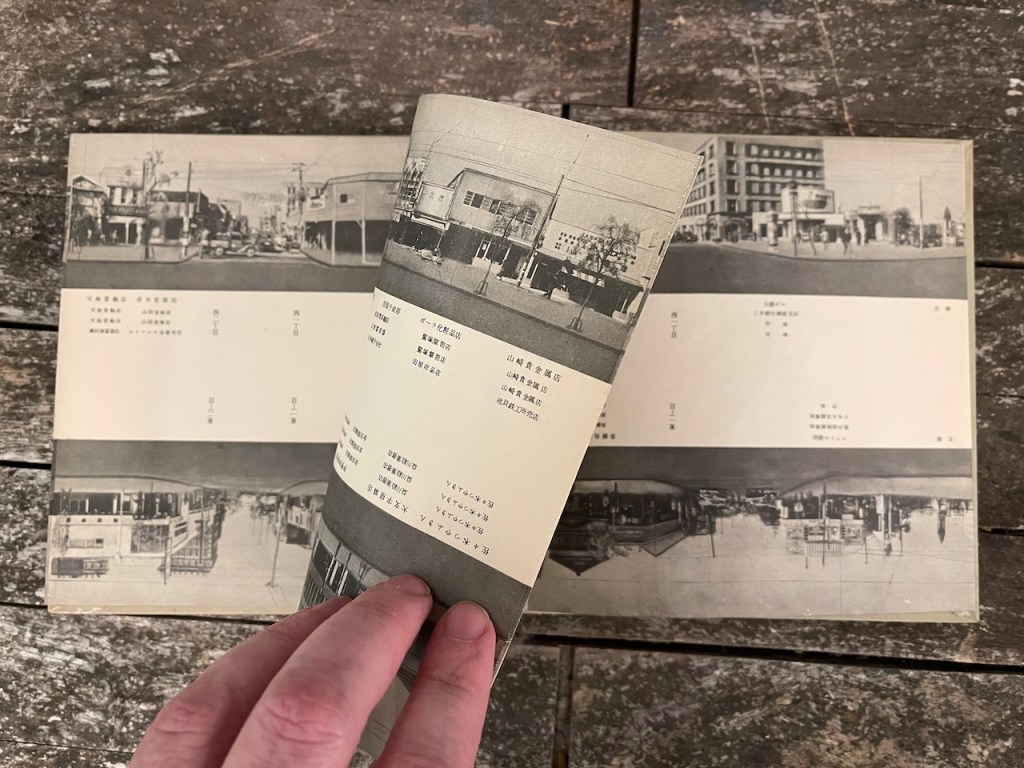
Let me describe the book Ginza Haccho to you. It is a thin, accordion-style book. In it are photographs of Ginza Street, photographs of one side of the road arrayed all-together in one continuous stream along the top. Small numbers below indicate the addresses. At the bottom, along the long unfolded book are similar photographs, a panorama of the other side of the road, but these are upside down.
It appears, like Every Building on Ginza Street, to be a direct and undeniable homage to Every Building On the Sunset Strip, except for the uncomfortable detail that it was printed in 1954 when Ed Ruscha was seventeen years old, while he was still living in Oklahoma City, two years before he moved to Los Angeles and two years before he started art school. And twelve years before he published Every Building On the Sunset Strip.
Say you wanted to photograph every building on a street in the Ginza district (or Los Angeles), how would you do it? I mean technically, how would you go about it?
You’d need a camera that would fire continuously (like Ed Ruscha used) or at preset intervals based on the distance traveled (like what the Steidl team did with their book). You’d do this for both sides of the street (say it runs north and south) and then you would arrange the resulting images in two long rows, edge to edge so that it appeared to be one long, photograph.
So far, so good. But here’s the problem. How do you print these in a book? You could use a regular book structure, with pages bound on one side, but a scroll would be so much nicer, right? And since scrolls are unwieldy and no one buys scrolls, you could do it as an accordion instead. One thing leads to another in a pretty obvious way, right?
So now you are at your workshop and you are mocking up the accordion book and you lay your two long, thin pano photographs of the street on the table to see how it will look–and a major problem jumps out. The photographs don’t line up. On the top photo, the pano starts out on the left at the extreme north of the street and goes southward, on the lower photo it does the opposite, that photo starts out on the left at the southward edge and running north. Oh no, they are not in sync. What to do?
Your first thought might be to cut up the lower photo and to rearrange the pieces so they run north to south, to match the upper photo. That will work, in a way, except now while the buildings themselves are now in the “correct” order, the edges of each of the cut-up photos don’t match up with the next photo. This doesn’t work. The illusion is broken, the whole premise of the project is broken. It’s just a bunch of photographs now.
Very soon you will, perhaps just out of curiosity, take your uncut lower photo and rotate it around so its north end matches up with the north end of the upper photo and its south end matches up with the south end of the upper photo. It’s a little odd at first, having the bottom upside down but it works. Imagine folding each side up, like one of those fake western movie towns where the town is all facade and no actual buildings and then imagine walking down that road you made between the two photos. It would be like it was real.
From a strictly geographic, mapping point of view, this new arrangement has great value. Not only can you see how all the buildings on one side go together but you can now see how they relate to the buildings across the road. It’s a map in a way, a data visualization achievement that would make Edward Tufte proud.
And it all flows, step-by-step, from the technical constraints, and the solutions to those constraints, presented by the original idea.
Whether Ruscha never so much as glimpsed Ginza Haccho or whether it sat, well-thumbed, in the passenger seat beside him in the truck as he drove down the Sunset Strip, tripod-mounted Nikon, click-clacking on the tripod in the truck bed, doesn’t matter at all in some ways. His book is still there, it is still in the context of his overall body of work, still in the context of the Los Angeles art scene. But the provenance of the idea matters greatly to our understanding of the genesis of that particular idea and to our appreciation for the flow of ideas from one artist to another, and of the flow of ideas from one culture to another.
To be clear, Ruscha’s prodigious artistic output and his prodigious art fame won’t change much no matter the origin of the idea for Sunset Strip. It isn’t Ed Ruscha we need to worry about, it’s the curators.
Artists copy and steal all of the time, it’s part of the process. My god, I redid Edward Weston’s toilet and commonly redo other works of art and base my work sometimes very directly upon that of other artists. So you’ll get no tsk, tsk, tsk from me. But what about the curators? Isn’t it their job to inform us of the context of an artwork’s creation–and certainly a near duplicate idea predating a book famed as a milestone original idea would seem relevant to the viewer–or is the curator’s role today to promulgate a certain point of view, facts ignorable when they don’t quite fit the narrative?
I’ve seen Every Building On the Sunset Strip many times at museums. Here are a few images from the San Francisco Museum of Modern Art in 2016:
Though the display case text panel doesn’t say much, a tour group came by shortly after I made this photograph and the guide was extolling Ruscha’s originality and innovative use of the book form–no mention or perhaps even knowledge of Ginza Haccho, despite the fact of the book’s publication thirteen years before Sunset Strip was made widely known by Martin Parr and Gerry Badger’s The Photobook: A History, Volume III, published in 2014. Whatever the whisperings before Parr and Badger’s book, there’s little excuse for not being aware of the issue after.
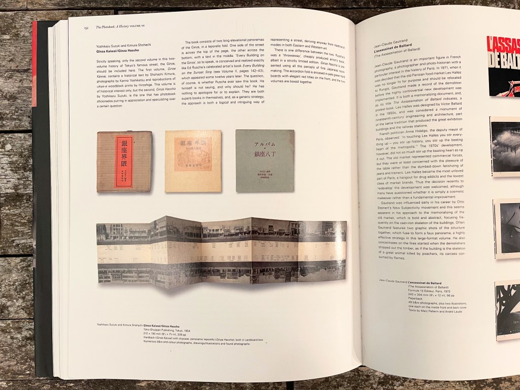
And yet, again and again, there is no mention of the Japanese predecessor. In the New York Times, on the web pages of the Met, MOMA, etc., etc., this odd pre-echo is ignored. They don’t seem to know or don’t seem to know what to do with what they know, or what they at least suspect.
Have a look at this painting, originally titled The Brothel of Avignon, by Picasso. It’s the key painting heralding the emergence of Cubism, a central work in the history of art. Uncountable words have been written about this work extolling its emergence upon the world:

Now let’s do a thought experiment, and imagine an earlier work is discovered in Africa, painted a decade before Picasso’s, entitled The Brothel of Alexandria:

Well, obviously it is a different work–the colors are different! And we don’t have any evidence that Picasso actually saw this earlier work–he certainly never said that he did, though to be fair the work was reprinted in an (imaginary) magazine dealing with African art, and Picasso was fond of African art.
But really, in our thought experiment, could we really talk about the newness, the innovativeness, the creation of Picasso’s Les Demoiselles d’Avignon without any reference to The Brothel of Alexandria?
What does exist, however–contrary to the idea that Ruscha “copied” Ginza Haccho— is the possibility that he hit on the idea independent of the work of Yoshikazu Suzuki. Not so far-fetched, here’s an example drawn from my own personal experience, an example of convergent evolution in the creation of art, one so striking as to give anyone pause who would consider the mere existence of Ginzo Haccho proof positive of Ruscha’s awareness of that book.
In 2010–my god, where do the years go?–I was working on a project involving candles and the nature of data and data gathering. My idea was simple.
What if I wanted to collect data on the weather each night, but do so photographically, do so visually? I don’t mean pictures of clouds or trees blurred as they swayed back and forth, I mean the actual data, just in an unusual form? Collect it in a language unfamiliar to humans, unreadable in the normal manner due to how our language and science has evolved, but lacking nothing in completeness or integrity?
The idea of “weather” proved too broad so I ended up thinking only about wind and gathering data on an evening’s wind patterns.
The trick is to consider variables and constants. You want to make everything that you can a constant so that what is left that is not a constant is the thing you want to record–the variable. A record of that variable is the data itself.
Let’s make this concrete. Say you are at an open bedroom window. Let’s say it is not only open but open a precise amount. Let’s also say that the dimensions of the window and the contours of its frame are also known precisely, modeled enough for any engineer. Let’s say further that the window screen is also characterized as exactly as the rest, everything measured and known.
Now we place a candle on a small table in front of the window, its size and position minutely noted, the materials making up the candle ensured to be uniform from one candle to the next, the wicks identical in all ways.
Everything so far is a constant, there’s no variation here at all until we introduce that variation, until we introduce the flame to the tip of the wick. Now the flame will flicker and dance in the faint, gentle breeze. As it burns down the candle the flame will not only flicker but will flicker across a period of time, its light recorded by a camera placed in front of it, measuring it, capturing that variation with the thought that the shape and intensity of the flame, as it moves downward, will keep intact, difficult as it might be to decipher, the record of the movement of the wind.
At some point it occurred to me that the flame was a three-dimensional shape and wouldn’t it be better if I had two cameras, one perpendicular to the other, to capture the flame from two fixed positions, blue-tape X’s marking the positions of the heavy-duty tripod legs, carefully chosen to maintain the measured geometric relationship of one camera’s view to the other. Then it occurred to me that I could overlay one image atop the other and, if I used the right blending technique, both sets of data might be preserved in one combined image.
Here’s what it looked like at one point, my Arca-Swiss 8×10 (with 4×5 reducing back) on the left, the Toyo 45 field camera on the right.

I shot nearly two hundred images of burning candles, one or two per evening, and it took three or four months to shoot them all. The whole time my side of the bed was taken up with my cameras and tripods–to get into bed I had to crawl across it each night from the far side or creep over the footboard if my wife was already asleep. And then back across in the morning. I didn’t want to disturb the data gathering.
The project was going to be called Faraday Candles, after Michal Faraday, who wrote a lovely essay on scientific thinking, using a burning candle as an example. Then, to my dismay, I had to change the name. I had discovered that my idea wasn’t mine, I discovered that there was a Ginza Haccho to my Faraday Candles, a real-life The Brothel of Alexandria and made by a photographer whose work I thought I knew: Hiroshi Sugimoto.
I first encountered Sugimoto’s work at the Akron Art Museum years before, which displayed an image from his series of movie theaters, their screens all glowing white. It was the Akron Civic Theater, appropriately enough, just a short walk away, and I remember the wall text said something deep and semi-incomprehensible–later I learned that Sugimoto had simply left the shutter open during the entire time the film was running (intellectually not to distant from my wind data project, as it turns out). He also did a series of famous seascapes which more people have seen by far than any of his other works as one of them was used for the cover of a U2 album. There were dioramas of animals and prehistoric man and wax museum figures but it isn’t until I had started shooting the images for my Faraday Candles project that I found his candles.
There they are, In Praise of Shadow, a red-colored photograph of an installation in 1998 of his work, printed in 2010’s Hiroshi Sugimoto (published by Hatje Cantz), 8×10 negatives held head-high on stands, a small bright light illuminating them and casting large shadows of the negatives upon the wall. The image on each negative is a candle, allowed to burn all the way down during a long exposure. He made prints of them, too.
Here’s how he introduces this work:
Japanese novelist Jun’ichiro Tanizaki disdained the “violent” artificial light wrought by modern civilization. I, too, am an anachronist: rather than live at the cutting edge of the contemporary, I feel more at ease in the absent past.
Domesticating fire marks humankind’s ascendancy over other species. For tens of thousands of years, we have illuminated the night with flames. Reflecting upon this, I decided to record “the life of a candle.” Late one midsummer night, I threw open the windows, and invited in the night breeze. Lighting a candle, I opened my camera lens. After several hours of wavering in the breeze, the candle burned out. Savoring the dark, I slowly closed the shutter. The candle’s life varied on any given night―short, intensely burning nights and long, constantly glowing nights―each different, yet equally lovely in its afterglow.
And here are the images themselves:


I couldn’t believe it. I just couldn’t believe it. His candles weren’t the same as my candles–like my own children whom I love more than anyone else’s children, my candle images were not only different but better–but they were close, oh so very close. Days passed as I pondered how to modify the project or maybe rethink the thing from scratch. But it was too late–the project had fixed in my head and could not be undone. I could abandon it, like leaving a baby under a tree in the woods, or I could move forward. So I moved forward, renaming the project Faraday/Sugimoto Candles to acknowledge the weird (and for me, unfortunate) revisiting of the same artistic space.
It’s one thing to redo another artist’s work and quite another to stumble into it quite by accident. But it happens. It happened to me. Maybe it happened to Ed Ruscha.
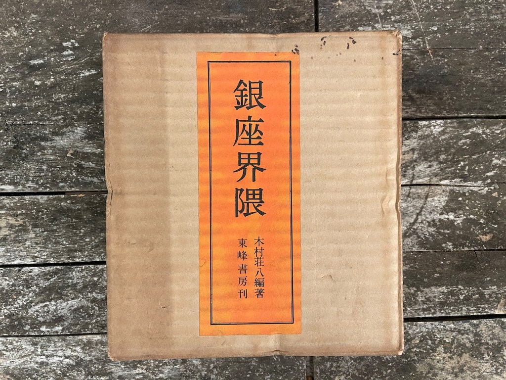
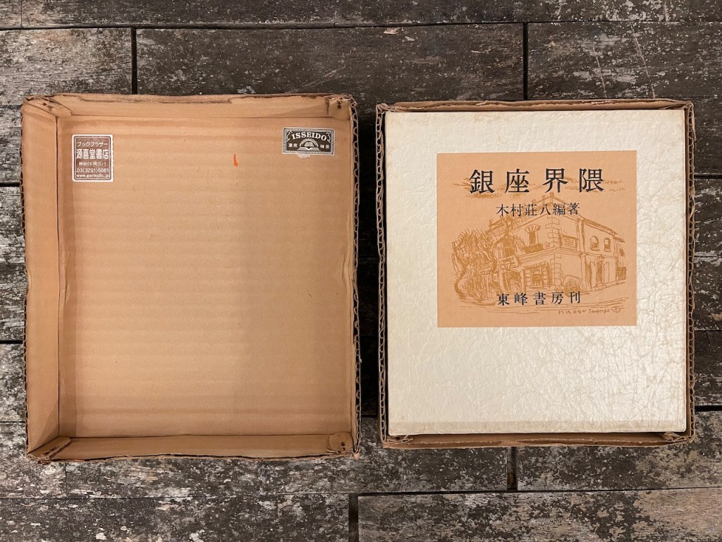
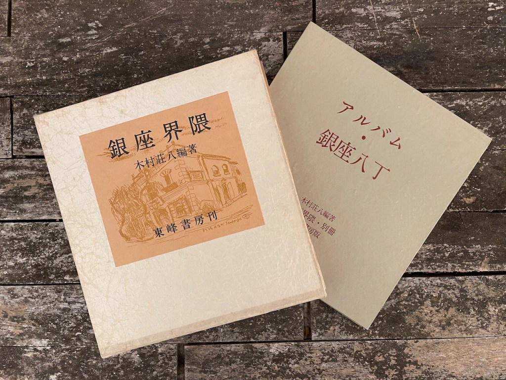
It comes in a square box of corrugated cardboard, stapled together at the corners. Inside are two volumes–the thicker volume is Ginza Kaiwai, a book filled with photographs, reproductions of drawings, and maps of what may be the Ginza District. It features two multicolored silkscreens, the ink bleeding through the back of the pages, and is cellophane-wrapped inside its own slipcase. It’s an interesting book but the fame of the set lies with the other volume, the thin Ginza Haccho.
Opened like a regular book, with a “page” on the left and right, Ginza Haccho is fourteen inches wide and seven and a half inches tall. Stretched out to its full length it expends to just under sixteen and a half feet.
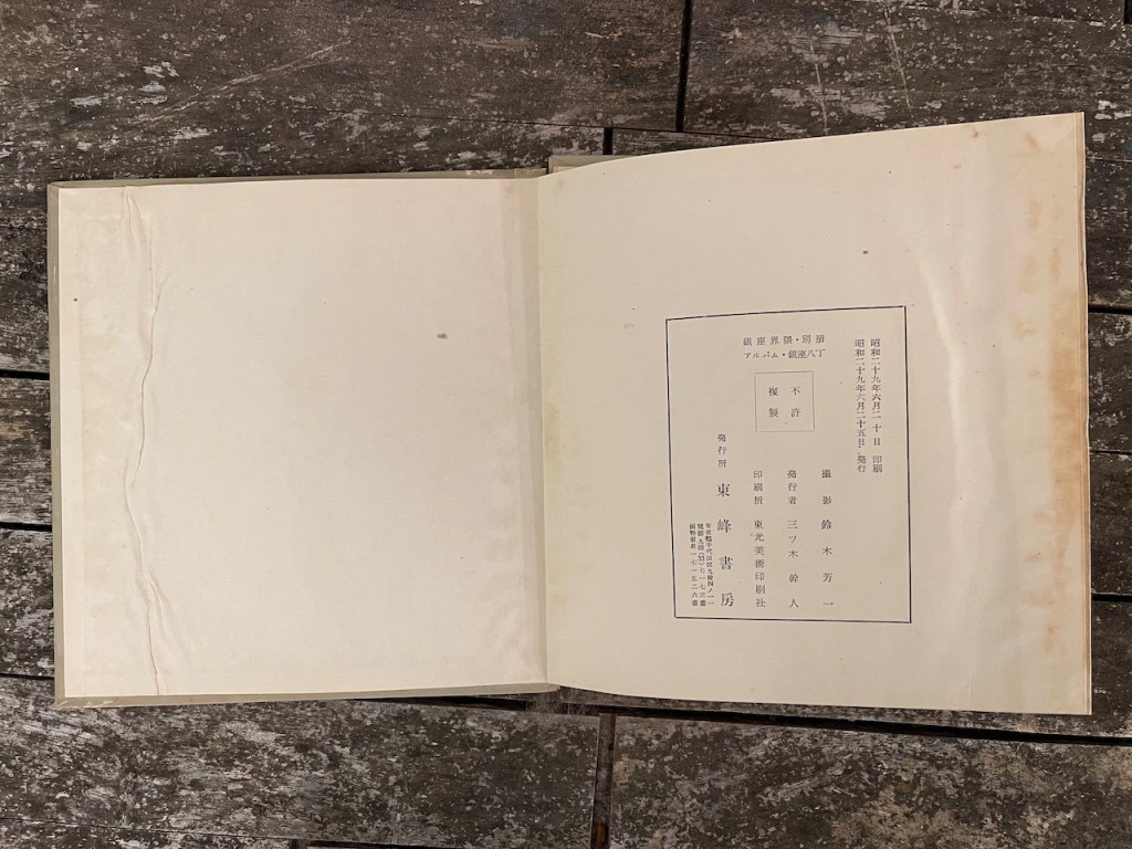
Here are a few snapshots of my own copy:
Looking closely at the photographs, no seams are visible at all. In fact, no cars on the street are visible at all. You see vehicles in the intersections, often inexplicably sideways, blocking traffic, but the “road” in the two long images is peanut butter smooth and may be entirely airbrushed in–the negative for the photographs may not have included the street itself. In addition, people walking the street sometimes have a strange look, as if they were cut and pasted in (with actual scissors and glue, of course), and then rephotographed. A great deal of airbrushing seems to have gone on, in fact, so much so the effect begins to resemble a model railroader’s diorama.
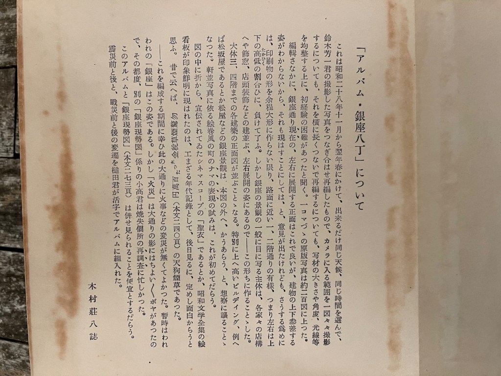
Given its potential importance in art history, I was intrigued by the page of introductory text, written of course, in Japanese.
I did take a semester of Japanese in college but I did not do well. Though otherwise a straight-A student and generally overbooked with too many credit hours, I nevertheless (with the imagined imperviousness of youth) enrolled for both the Japanese course and something called “Data Structures and Algorithms II,” which was a weeder class for those hoping to become computer scientists. This was one of those classes where they post grades on the outside of the classroom door and students gather around, venting their frustration. It was a tough class, fast and furious, and I started to fall woefully behind, the Japanese language course, also difficult, tanking alongside it, each pushing the other under the waves. Six weeks into the semester I dropped the Japanese class, got my one and only “D” in the programming class, then re-enrolled in “Data Structures” and earned the hate of the budding computer programmers (I was not one of them) when I maintained my position at the top of the class throughout, making the grading curve a most difficult one. Competition at school can be fierce and merciless but I was afraid of that Japanese class and never retook it.
I ran the Ginza Haccho text through the iPhone version of Google Translate (which accepts images as input) and the result was most impressive but fragmented and increasingly garbled as the text went on.
Luckily, Yukari Chikura offered to translate the text for me. If you are at all interested in photobooks you already know her name. She is the photographer and author of Zaido, one of the most admired photobooks published in the past year or two, and her book–I say this literally–is on almost every “best of” photobook list out there. I reviewed her book here and published an interview with her here.
Her translated text:
About the album “Ginza 8”.
This album is a compilation of photographs taken by Hoichi Suzuki from November 1953 to spring 1955, in the same weather conditions and at the same time as possible. In addition, it was the first time for him to experience the difficulties of the process. The number of original photographs, one frame at a time, was about 200. During the editing process, it was suggested that the current front view of Ginza-dori, which extends from left to right, was fine, but that the ups and downs of the buildings could not be seen, and that this should also be shown. In other words, the left and right sides are outweighed by the proportions of the upper and lower levels. However, the main part of Ginza’s scenery that is seen by the general public is the left-right development of each house’s storefronts, decorative windows, storefront decorations, etc. so we decided to make it this way. The front view of each building, up to the third or fourth floor, is lined up.
Buildings that are particularly high up, such as Matsuzakaya and Matsuya, are left to the imagination. This is probably the first attempt at a real representation of the town in the style of a picture scroll using photographs of the buildings. It is interesting to note that the CinemaScope “Holy Clothes”, which had been advertised for some time, and the picture signboards of the complete collection of Showa literature appeared clearly in the pictures. In the old days, it was Tengu cigarettes, which were “Don’t be surprised, only 1 million yen in taxes.” (page 240).—Fortunately, at the time of composing this, there were no domestic disturbances on this main street. For a while, this is what our “Ginza” looked like. However, there were a few fires in the shadow of the boulevard, so Mr. Odaka, the author of the other “Current Situation in Ginza” album, was busy reexamining the burned areas each time. It would be convenient to see this album and the “Ginza Gensetsuzu” (page 273 of the text) together.
The changes before and after the earthquake, and before and after the war were incorporated into the album by Mr. Tsuchida in type.
Shohachiro Kimura
Ginza Haccho would seem to be fertile ground for an art historian. I look forward to one of them taking an interest.
Five thousand copies of Every Building On the Sunset Strip were made, at a printing cost of one dollar each. In the early 1970’s you could buy it new for $8.
Search any major museum and you’ll find a copy in almost every collection, even if they were late to the game and had to pay thousands of dollars to obtain it. Search those same collections and you won’t find any mention of Ginza Haccho.
At the Getty website you can drive down Ed Ruscha’s Sunset Strip. In fact, there’s twelve of them, made from 1965 all the way to 2007. You pick your year, pick your vehicle–the Datsun truck is the most authentic but the hippie van and the VW Bug are the more nostalgic for aging boomers–and you click the arrows to move. The Getty didn’t do as I suggested above, to place the images left and right and drive down the street but if you can get around the upside-down lower image (and you can switch which is which) you can cruise right along.
They scanned more than 65,000 negatives for the source material for this project. You can imagine the money that went into this, what with the scanning expense, the programming, the artificial intelligence tagging. Lots of work, lots of effort.
Why don’t museums, who are so eager to impart their moral wisdom upon us, who find “colonialism” in every corner of their collection and who bring all the apparatus of academic political “theories” to every nuance of modern life, so much as offer to us a footnote about Ruscha’s apparent inspiration from a Japanese photobook?
I often photograph art exhibits that I find particularly noteworthy and thus sometimes end up photographing only the informational placards. I have a collection of these, documenting the buzzwords and intellectual fads as they wash over the art world.
The placards change from season to season but all read like artist statements, full of sound and fury, etc etc.


